Style Guide
To maintain a consistent UI (and therfore UX), this style guide provides developers with paradigms and instructions to work with. These guidelines are to be respected when making changes to the UI.
Tables
A main part of LOST are the tables. So with defining how they are placed and which component to use for them, a big part of LOST becomes consistent.
The component used for tables is CoreDataTable, based on CoreUI's CTable.
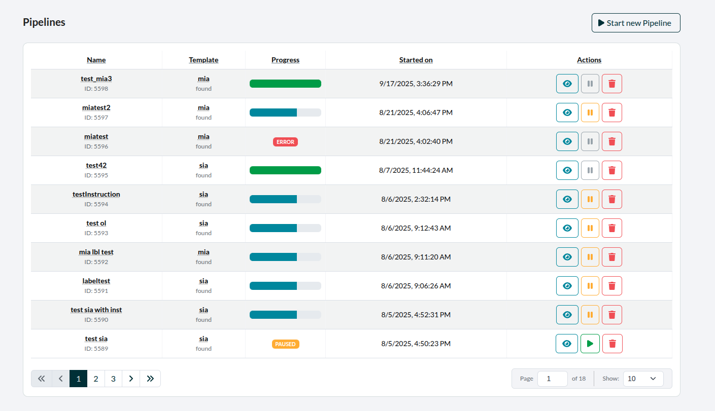 Figure 1: CoreDataTable in use (here for the Pipeline-Tab).
Table/Page Header
Typically, above the left corner of the table, there will be the headline. Above the right corner, there is button with the function to add an element of whatever the table displays, if applicable.
There is a custom component used for this called TableHeader, which implements this.
Buttons
For implementing Buttons, the first choice should be the custom CoreIconButton component, which is based on CoreUI's CButton.
Default Colors
The colors used for buttons are taken from CoreUI Colors.
In the _variables.scss they are defined as follows:
$primary: #092f38;
$info: #14859e;
Aside from primary and info, the other CoreUI-colors used are: secondary, success, warning and danger. These use the default color values provided by CoreUI like this:
$secondary:     #6b7785;
$success:       #1b9e3e;
$warning:       #f9b115;
$danger:        #e55353;

Figure 2: Color palette in order of button usage (with exception of secondary), see below.
Color Usage
Which color a button has is defined by its function.
Primary: The main buttons with core functionality. (Like starting annotations, pagination)
Secondary: Used for disabled buttons. (As buttons are only outlined per default, this increases readability.) Also for additional colors in elements like pagination, where it contributes to readabilty.
Info: For functionality leading to further information, like inspecting pipelines.
Success: Mainly only used for unpausing pipelines (as to functionally contrast warning below).
Warning: For actions to be done carfully (but that are typically reversible). Examples would be: Editing an element or pausing a pipeline.
Danger: For deleting elements or other risky (typically irreversible) actions.
Button Order
When it comes to placement from left to right or up to down, the buttons are ordered by function. Since these functions have designated colors, we can also say, that the buttons are therefore ordered by color.
With that in mind, the order is as follows:
- info
- success
- warning
- danger
- primary
A disabled button stays where its actual color would be.

Figure 3: An example of the button order.